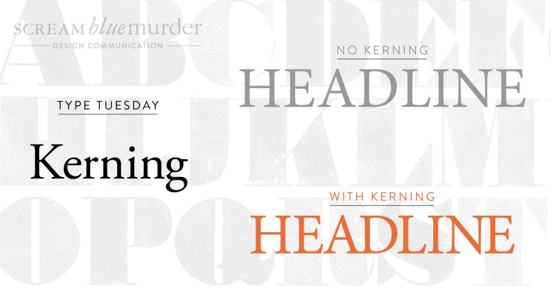
Typography Tuesday – What is kerning?
Scream Blue Murder

Welcome to Type Tuesday.
Every Tuesday, we’ll be exploring the use of type in the modern-day language, delving into the various design nuances – some which you may know, others which may have been forgotten.
Today we’re talking about the icing on the cake, the finishing touch or attention to detail that, as designers, we notice and use to improve your typography….and that attention to detail is ‘kerning.’
Typography – What is kerning?
‘Kerning’ is the reduction of white space between two characters to create text that is easy on the eye and easy to read. On text applications, kerning usually affects only the character pairs that possess the greatest amount of excess white space, and when used, it creates a more balanced and considered setting. (Reference: Type Matters by Jim Williams
Featured in a blog from Adobe designer Madeline DeCotes, she says, “Kerning is a strikingly subjective artwork. The designer needs to look at the space between each letter in a word and ask, ‘Does this look like enough space? Does this look like too much? Are the letters too tight?'”
Top 4 tips for kerning
- Try to kern headlines only, don’t worry about the body text
- Print out your work to get a different perspective
- If in doubt, turn it upside down to view the spacing between the letters
- Imagine you are reading the text in a different language; how does it look?
Benefits of kerning
· It improves the appearance and design of your text
· It’s easier to understand and read
· It makes your text look more visually appealing, polished and professional
Just Google ‘bad kerning examples’ and tell us what you think!
We don’t whisper your story. We Scream Blue Murder.
A design and marketing communications agency.