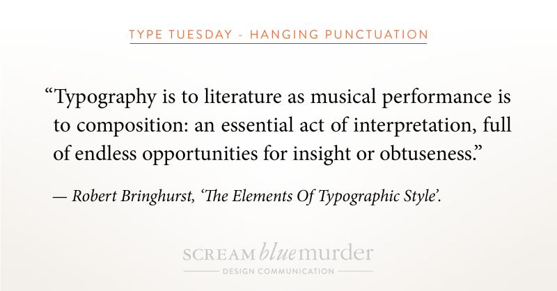
Type Tuesday – Hanging punctuation – what is it?
Scream Blue Murder

Welcome to Type Tuesday!
To hang or not to hang…? That is today’s question as we investigate hanging punctuation!
Actually, we are exploring if opening punctuation marks should sit outside a body of type or should they align with the type?
Hanging punctuation – what is it?
Hanging punctuation is a method of setting the opening punctuation marks outside the margins of a body of type. As a result, it creates a uniform edge, giving it a much cleaner, sharper alignment and feel for easier, uninterrupted reading. Conversely, when punctuation isn’t hung, it creates a visual indent that distracts the eye and makes the type look sloppy and harder to read. It can be applied to any body of text, whether left justified, right justified or fully justified.
According to Wikipedia, it is so-called because the punctuation appears to land in the margin of the text and is not incorporated into the block or column of text.
Hanging punctuation – where did it originate?
As it happens, German inventor, printer and publisher, Johannes Gutenberg developed this style of punctuation when creating his Bible in the 1400s.
How to design hanging punctuation in In Design
InDesign provides great tools for creating hanging punctuation in the bodies of text. We thought we’d share our handy tips on designing hanging punctuation using this software as we use this in the office. So, please take a look at our video or check out the four steps below.
1. Highlight text
2. Menu >Type>Story
3. Check ‘Optical Margin Alignment’
4. Click the icon next to the form field for ‘Align based on size’ or manually input a size until it looks right!
(Insert Video)
We don’t whisper your story. We Scream Blue Murder.
A design and marketing communications agency.
Scream Blue Murder